High Converting Landing Page Fundamentals Every Business Needs
Build a high-converting landing page with persuasive copy, strong CTAs, trust signals, optimized forms, and continuous testing.

The ad spend report is open. Cost per click is healthy. Traffic is coming in. But the leads are not. The instinct is to blame the ad. The real problem, in most cases, is the page it lands on.
Most businesses build landing pages the way they build brochures: focused on appearance rather than conversion architecture. A high-converting landing page is not a design project. It is a system with specific components that work together to move a visitor from arrival to action. This article covers each of those components, from above-the-fold structure and headline construction to trust signals, form design, and testing frameworks.
WellsGroup works with scaling businesses to audit, redesign, and operate landing pages as conversion systems rather than static assets. Book a free consultation to see where your current page stands.
Why Most Landing Pages Fail Before the Visitor Scrolls
A visitor makes a judgment about your page within the first few seconds of arrival. If the landing page above-the-fold design does not immediately communicate relevance, the visitor leaves. No amount of well-crafted copy below the fold recovers that exit.
The structural reasons pages fail at this stage are consistent across industries:
-
Cluttered above the fold area with too many competing messages
-
Headlines that describe the product instead of addressing the visitor's outcome
-
Slow load speed that kills engagement before the page even renders
-
No clear single action for the visitor to take
Landing page load speed conversion rate data confirms the compounding cost of slow pages. Every additional second of load time reduces conversions measurably, and the damage is worse on mobile, where attention windows are shorter.
The broader framing issue is that most businesses send paid and organic traffic to their homepage rather than a dedicated page. This is one of the most costly and common conversion mistakes made in digital marketing.
The Difference Between a Landing Page and a Homepage
A homepage serves multiple audiences simultaneously. It introduces the brand, navigates visitors to different service areas, and addresses several buying stages at once. A landing page has one job: convert a specific visitor to a specific offer.
This distinction matters because the landing page vs homepage conversion gap is significant and measurable. The median dedicated landing page across all industries converts at 4.02%, nearly double the 2.35% median for general website pages, and the top 25% of landing pages reach 11.45% or higher. Sending campaign traffic to a homepage instead of a purpose-built page means starting at a structural disadvantage before a single visitor reads a word.
The landing page conversion rate benchmark by industry varies, but the principle holds regardless of vertical: a focused page built around one action consistently outperforms a general page built around many.
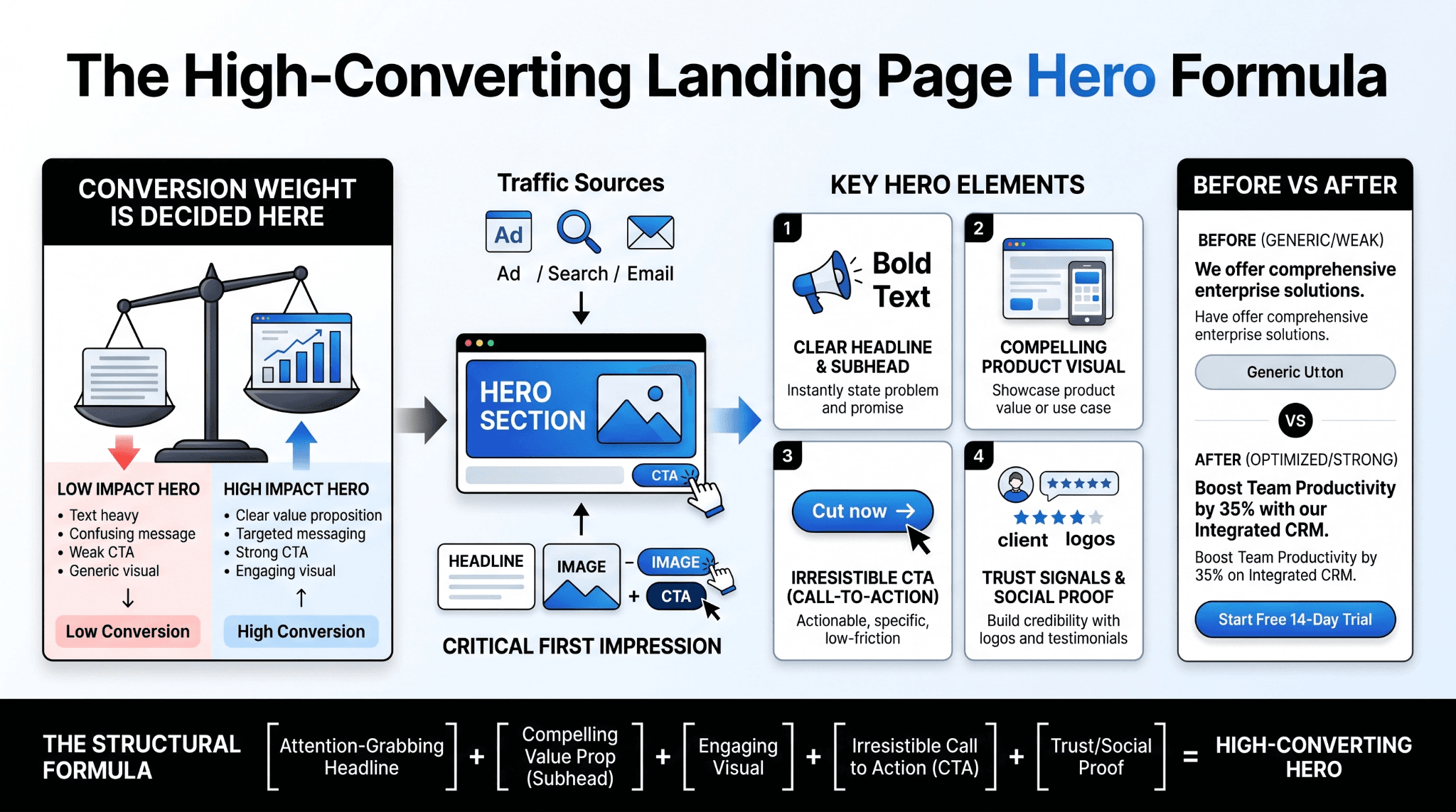
The Hero Section of a High-Converting Landing Page
The hero section is the first visible block of content on the page. For a high-converting landing page, this section carries the heaviest conversion weight. If the headline, subheadline, visual, and primary CTA do not align with what the visitor came looking for, the rest of the page rarely gets read.
Landing page hero section best practices in 2026 center on message match and clarity, not aesthetic complexity. The visitor arrived from somewhere, an ad, a search result, an email, and the hero must immediately reflect the promise that brought them there.
The four elements that must work together in the hero section are:
-
Headline: The single most important conversion lever on the page
-
Subheadline: Expands on the headline and bridges the value proposition to the visitor's situation
-
Supporting visual: Reinforces the offer without adding cognitive load
-
Primary CTA: One clear action, positioned where the eye naturally lands
Landing page value proposition examples that perform well are outcome-focused rather than feature-focused. A SaaS company does not lead with "AI-powered workflow automation." It leads with "Cut your team's manual workload by 40% in the first month."
Writing a Headline That Converts
Knowing how to write a landing page headline starts with one principle: the visitor does not care what your product does. They care what it does for them. Every effective headline formula leads with the outcome, not the mechanism.
A practical structure that works across most business types:
-
Outcome + Timeframe: "Generate qualified leads from your website in 30 days."
-
Problem + Resolution: "Stop losing leads to a website that was not built to convert."
-
Specificity over cleverness: Concrete numbers and clear language outperform creative wordplay every time
The headline should also match the language of the source that brought the visitor in. A visitor who clicked an ad about "B2B lead generation" should land on a page whose headline includes that exact phrase or a close variant. Mismatch between ad and page is one of the fastest ways to lose a visitor who had every intention of converting.
Page Structure and the Logic of Visual Flow
Once the hero section holds the visitor, the rest of the page needs to carry them toward the conversion point without friction or distraction. This is where landing page whitespace design and section sequencing become operational tools rather than aesthetic choices.
A well-structured landing page follows a logical sequence that mirrors the visitor's internal decision process. These single-page website conversion tips form the backbone of that sequence:
-
Open with the outcome (hero section)
-
Establish credibility (social proof, client logos, certifications)
-
Address the problem in the visitor's own terms
-
Present the solution with enough specificity to be convincing
-
Remove objections through FAQs or feature comparisons
-
Close with a final CTA
The landing page UX checklist for 2026 adds one non-negotiable requirement to this sequence: every element on the page should either move the visitor closer to the conversion point or be removed.
Why Removing the Navigation Menu Increases Conversions
Every link on a landing page is an exit door. A full navigation menu gives a visitor eight to twelve ways to leave before converting. This is why a landing page without a navigation menu is not just a design preference but a conversion principle.
The 2026 data supports removing navigation as one of the highest-return structural changes a page can make. When the only path forward is the CTA, a meaningful portion of visitors who would have wandered away instead convert. For pages where brand trust is a factor, a minimal footer with a privacy link is sufficient. The navigation does not need to return until the visitor has completed the conversion action.
The High Converting Landing Page Copy and CTA Formula
The copy on a high-converting landing page follows a clear structural logic. It does not simply describe the offer. It walks the visitor through a sequence that builds desire and removes resistance.
The landing page copy formula that works consistently across industries follows this structure:
-
Identify the visitor's current problem or goal
-
Agitate the cost of not solving it
-
Present the solution with specificity
-
Prove the claim with evidence
-
Ask for one action
This sequence works because it mirrors how buying decisions actually form. Visitors do not convert because a page looks good. They convert because the page reflects their situation accurately enough that the CTA feels like the logical next step.
CTA Placement and Button Language That Works
Landing page CTA button best practices in 2026 have shifted away from placement debates and toward message specificity. The question of how many CTAs on a landing page is largely resolved: one primary CTA repeated at logical intervals, typically above the fold, mid-page after a key proof point, and at the bottom.
Button language is where most pages leave conversions on the table. Generic phrases like "Submit," "Click Here," or "Get Started" perform consistently below action-oriented alternatives. The highest-converting CTA language is benefit-specific:
-
"Get My Free Audit" outperforms "Submit."
-
"Start Generating Leads" outperforms "Sign Up."
-
"See How It Works" outperforms "Learn More."
The pattern is consistent: the button text should complete the sentence "I want to..." from the visitor's perspective.
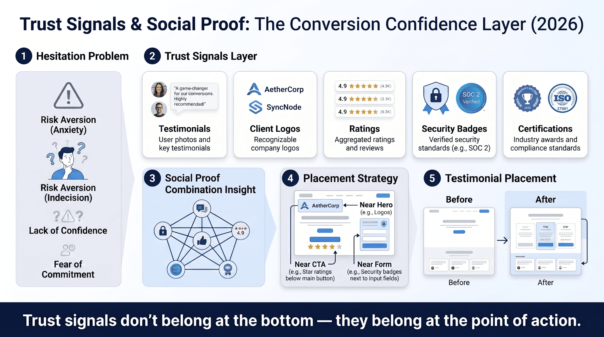
Trust Signals and Social Proof: Removing the Doubt That Kills Conversions
Even a visitor who is genuinely interested in an offer will hesitate before converting. Landing page trust signals exist to address that hesitation directly. Without them, the gap between interest and action stays open.
The landing page trust signals that carry the most weight in a B2B context include:
-
Named client testimonials with job title and company
-
Recognizable client logos placed prominently
-
Third-party review counts and ratings
-
Security badges on form pages
-
Industry certifications relevant to the buyer's sector
The combination matters as much as the individual elements. A page with five weak trust signals performs worse than a page with two strong, specific ones.
Where to Place Social Proof for Maximum Impact
Landing page social proof placement follows a proximity principle: trust signals perform best when placed near the point of conversion, not buried at the bottom of the page.
The most effective placement sequence is:
-
Client logos immediately below the hero section to establish credibility early
-
A specific testimonial adjacent to or immediately above the primary CTA
-
Review counts or aggregate ratings near the form
Moving a testimonial from the footer to a position just above the CTA is one of the most consistently high-return layout changes a landing page can make. The visitor needs reassurance at the exact moment they are deciding whether to act, not after they have already scrolled past the conversion point.
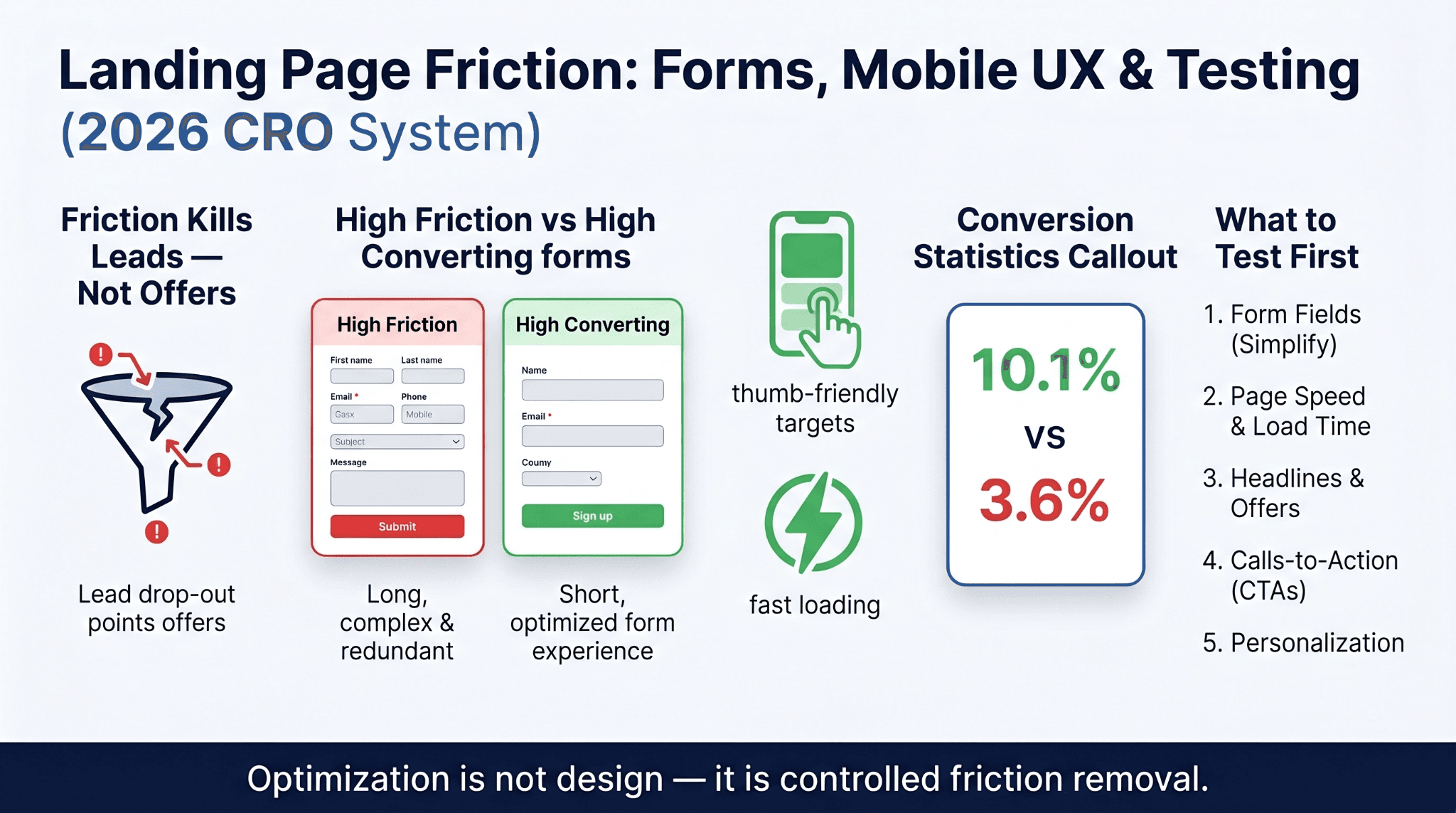
Forms, Mobile Design, and the Friction That Costs You Leads
Form design and mobile experience are the two most common places where landing pages lose visitors who had already decided to convert. The friction is not in the copy or the offer. It is in the mechanics of completing the action.
Landing page form design best practices in 2026 center on one principle: only ask for what is necessary at this stage of the funnel. For a top-of-funnel lead capture, name and email are almost always sufficient. Adding phone number, company size, budget range, and industry to that same form introduces enough friction to reduce completions significantly.
Mobile landing page design tips have also evolved beyond simple responsive layouts. In 2026, mobile-first design means:
-
Tap targets sized for thumbs, not cursors
-
Forms that auto-populate where possible
-
CTAs pinned or prominently placed without requiring a scroll
-
Page weight kept low enough for fast rendering on cellular connections
How Many Form Fields Are Too Many
The relationship between form field count and completion rate is well-documented. Reducing form fields from the industry average to three fields or fewer produces a measurable lift in submissions. Per the Unbounce 2026 Conversion Benchmark Report, three-field forms convert at 10.1% while nine-field forms drop to 3.6%, with the steepest decline occurring between four and seven fields (digitalapplied.com, 2026).
Progressive profiling is the operational fix for teams that need richer data. Capture the minimum at first contact. Collect additional information through follow-up emails, nurture sequences, or on a thank-you page where the visitor is already in a positive conversion state.
Testing Your Landing Page: How to Know What Is Actually Working
A landing page that was built well still needs to be tested. Visitor behavior shifts, market conditions change, and assumptions made during build are not always accurate once real traffic arrives. Landing page A/B testing for beginners is not about running constant experiments. It is about testing the highest-variance elements in a disciplined sequence.
The landing page conversion rate benchmark by industry gives a useful performance floor, but the more important comparison is against your own previous results. Testing is the mechanism that closes the gap between where your page is and where it could be.
What to Test First and Why
The four elements that drive the majority of landing page performance variance are, in order of testing priority: the headline, the hero image, the primary CTA, and the form. Testing on these elements produces statistically significant results far more reliably than testing button colors, footer copy, or minor layout changes.
A prioritized testing sequence for teams building a CRO practice:
-
Test 1: Headline, one outcome-focused variant against one feature-focused variant
-
Test 2: CTA button text, one generic phrase against one benefit-specific phrase
-
Test 3: Form length, current field count against a reduced version
-
Test 4: Social proof placement, footer position against above-CTA position
The compounding value of this practice is significant. A/B testing improves landing page conversions by 49% on average, yet only 44% of companies regularly test their landing pages. The gap between teams that test systematically and those that do not is not a minor performance difference. It is a structural revenue advantage that grows over time.
What Business Owners and Marketers Ask About Landing Pages
The questions below reflect the real decision points that founders, marketers, and operations leaders encounter when building or improving a landing page. Each answer is kept direct and practical.
What is a good landing page conversion rate?
It depends on your industry and traffic source. The median across all industries sits at approximately 4% to 6.6%, with top performers reaching 11% or higher. A B2B SaaS page converting at 3.8% is performing at or above its industry average, while the same rate for a financial services page would be below benchmark. Always compare against your vertical, not the global average.
Should every ad campaign have its own landing page?
Yes. Message match between the ad and the landing page is one of the strongest conversion levers available. A visitor who clicks an ad about a specific offer and lands on a generic homepage experiences an immediate disconnect that most will not stay to resolve.
How long should a landing page be?
As long as it needs to be to answer every objection a qualified visitor might have, and no longer. Simple, low-commitment offers can convert on short pages. High-consideration B2B offers typically require more proof, more specificity, and more structured copy to move a visitor to action.
What is the biggest mistake businesses make on landing pages?
Treating the landing page as a design deliverable rather than a conversion system. A page that looks polished but lacks message match, a clear CTA, trust signals, and a tested structure will consistently underperform a simpler page built around conversion logic. WellsGroup approaches every landing page as an operational asset, not a creative output.
From Page to Pipeline: The Standard Your Landing Page Should Meet
A landing page is not a design asset. It is the operational boundary between your marketing spend and your revenue pipeline. Every dollar spent on traffic either converts on the page or does not. There is no middle ground.
The fundamentals covered in this article, above-the-fold clarity, hero section structure, copy sequencing, CTA precision, trust signal placement, form simplicity, and disciplined testing, are not optimization tactics. They are the baseline infrastructure that a high-converting landing page must have before any traffic arrives.
The businesses pulling ahead in 2026 are not those spending more on ads. They are the ones who have built the conversion layer correctly. WellsGroup designs and operates high-converting landing page infrastructure built around behavioral data, conversion architecture, and continuous optimization. To see what that looks like for your business, request a proposal, and our team will walk you through a tailored assessment.